Global Assessment
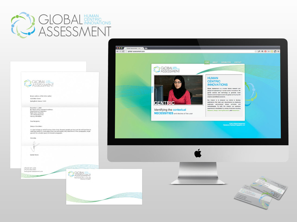
Shatha Samman started her business to help companies learn how to create user interfaces that work from a global perspective. We were tasked with creating a brand that encompassed the idea of human centric innovations. We used a cool color palette and a series of interlocking human figures to create the logo icon and a clean sans-serif typeface to communicate a modern, forward thinking message.
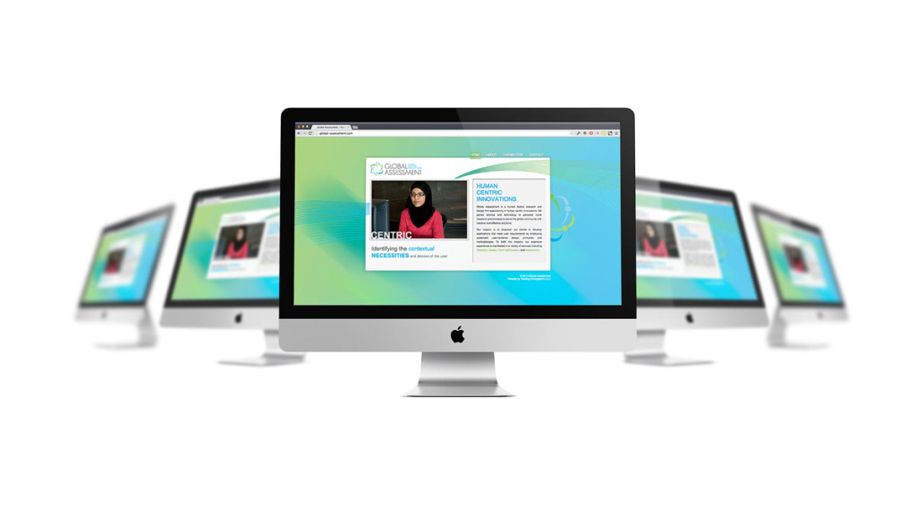
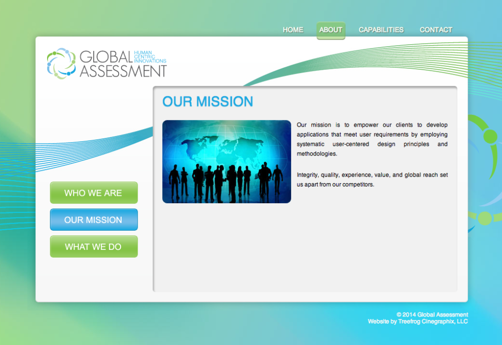
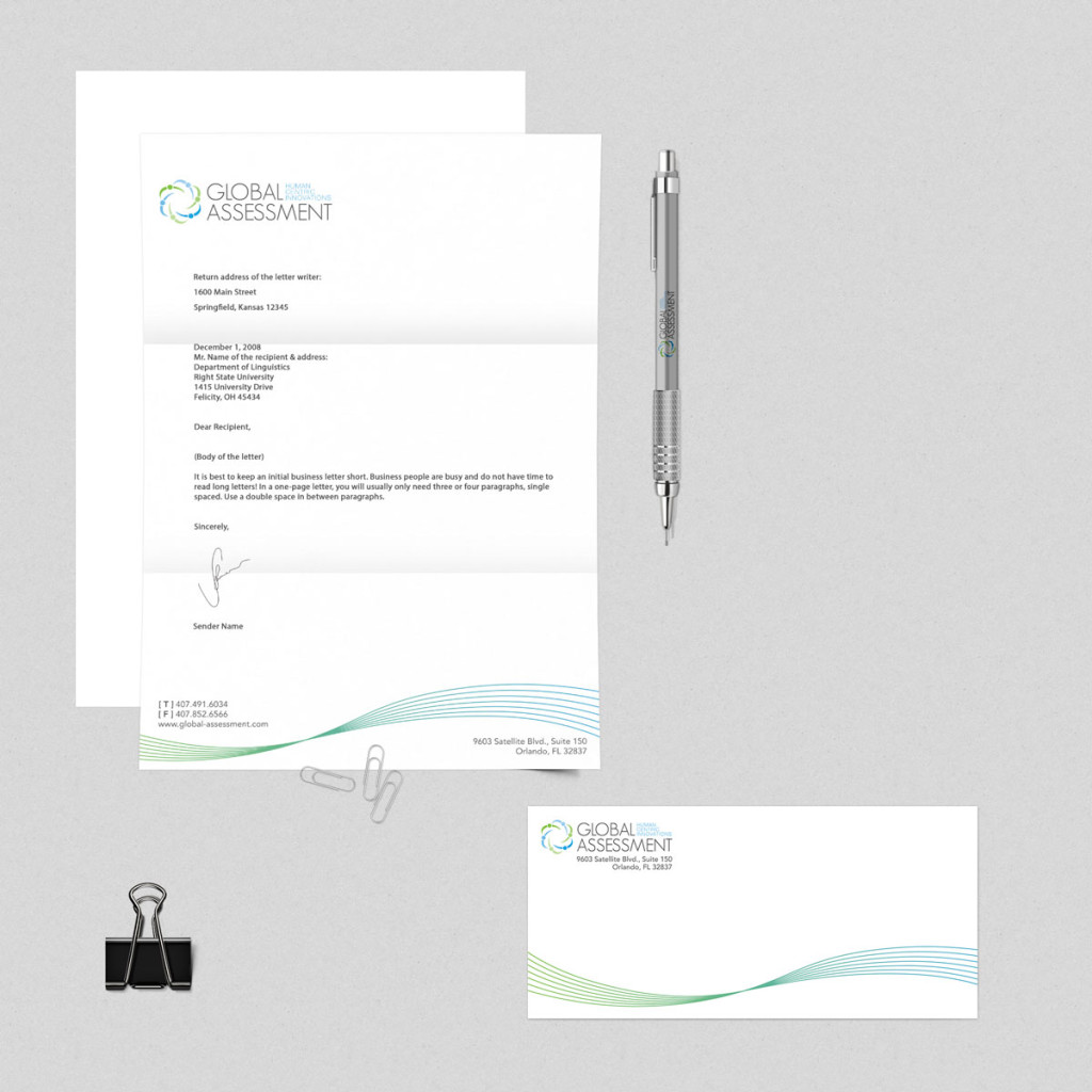
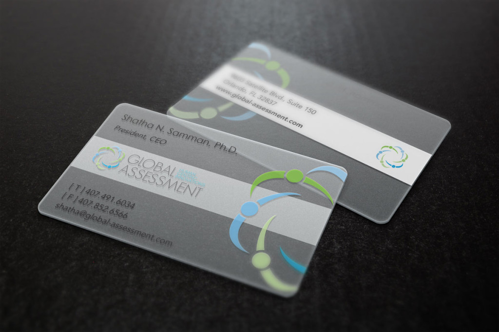
We also designed collateral incorporating a series of lines in the shape of a wave to continue the forward thinking idea. The business cards are printed on a frosted transparent plastic and the microsite is built in PHP with jQuery javascript effects powering a rich interface.
View Website

