WHO LOVES THEM SOME SHAPES? I sure do. Around here, they call me Shapemaster Dan. They don’t, but it would be great if they did. Now, I know what you’re thinking: “Handsome Shapemaster, I learned everything I need to know about shapes back in elementary school. What value could they possibly have in my boring, grown-up life?” I’m glad you asked.
Geometry, basically the study of shapes, has been practiced and lauded since early human history. But I’m not here to talk about Euclid and my main-man Descartes. I would like to share some personal stories about how shapes have been an important part of my life, both as a designer, and as a really awesome designer.
Planning
“Out of the box thinking is so passé, there’s so many other shapes.” Chaz, Designer//Slash//Model
What’s the best way to show a client a rough idea of what’s in your head? The answer is certainly not with shapes, but that doesn’t stop you from trying. Enter the humble wireframe, a key step in producing a carefully thought-out design. It’s the intermediate place between your imagination and the grueling hours you’re going to spend realizing those ideas. Everything that will make up the final product is blocked out with basic shapes.
“But it’s just a bunch of rectangles,” you might say. Well, so are the dolla dolla bills I’m cashing out when my design helps your product make it big. Wireframes can be an invaluable tool to gather feedback from a client. Even if the client will never see their product’s wireframes, the designer can find them very useful too. Drafting a wireframe makes spatial relationships apparent, enabling refinements to the design’s hierarchy before any real work is done.
During the design process, I’ve had a lot of moments where I thought: “That looked much better as a rectangle with ‘tags’ written on it”. This is a useful realization. It means that the core concept is still sound, but the implementation was flawed. Without a wireframe, a designer in that position might just pick up and move on before figuring out what really works.
Inspiration
Designers don’t nitpick the design of every little thing because they’re insufferable people, they’re also practicing an important habit to reinforce their primary focus. They’re sharpening the saw. Designers practice their trade everywhere they go. They may be most vocal about things poorly designed, but most designers spend their personal time appreciating anything carefully crafted.
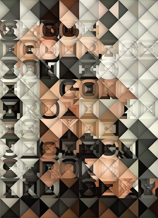
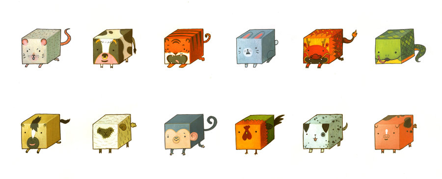
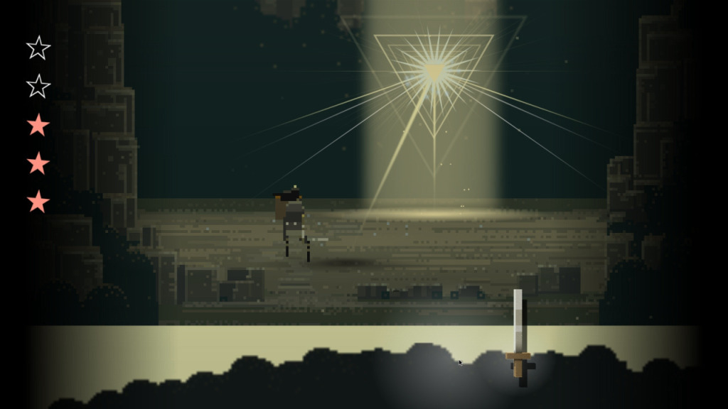
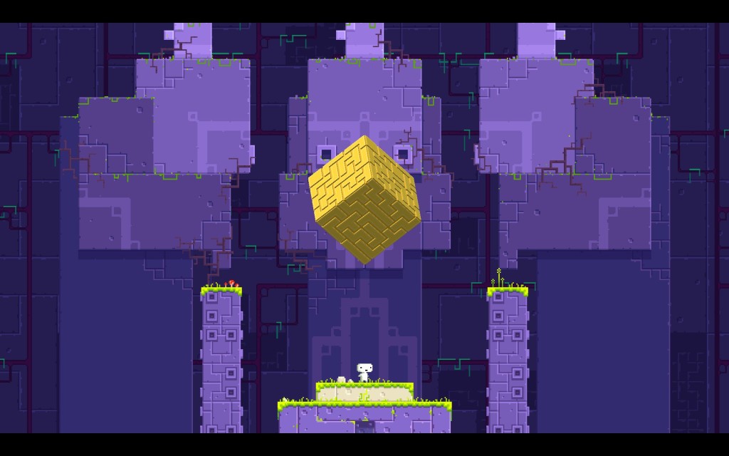
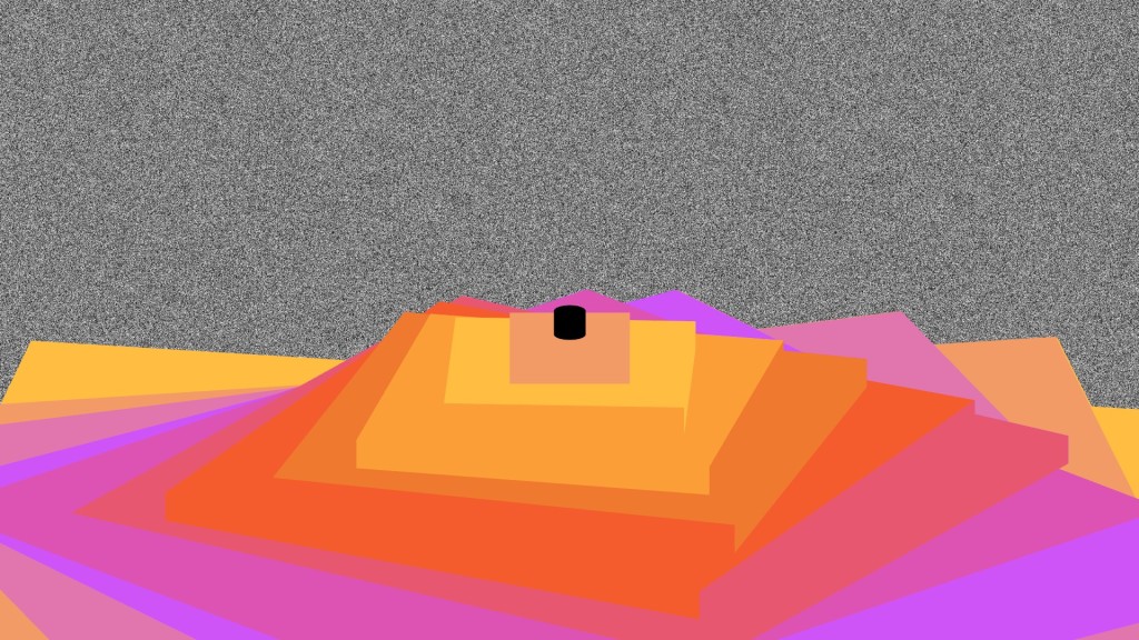
I hold geometric designs in particularly high regard. When I’m looking for enrichment, I often look to designers who harness lines and shapes in interesting ways. Below is a gallery featuring some of my favorite works, in graphic, video, and interactive mediums.


The Dangers of Shapes
Designers often fall prey to the madness that is Shape Obsession. Not me, though. No, sir.
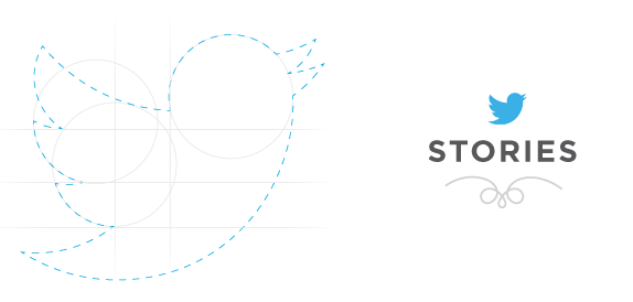
These unfortunate wretches will make any attempt to shoehorn their ideas into the pleasing fractalline segments of the Golden Ratio. They say this pleases their god, the Greek character Phi. No creative work is safe. New branding will come laced with an overlay of circles and lines in a desperate bid to highlight its geometric origins. The Grid is their lifeblood. It is their prison.
It shouldn’t be necessary to rationalize or defend your decisions based on mathematical properties, unless that kind of rigidity matches the character of the client. Brands should be designed to compliment the merits of the company, not the personal aesthetic of the designer.
That said, I think a stint in shape-heavy design is helpful for any designer. Learning to meter your efforts and not let the shapes overwhelm your work has applications beyond just composition and balance. Thoughtfully breaking the grid can show just how much you appreciate the grid everywhere else.
Shapes exist in the nebulous realm between the imaginary and the physical. They convey a sense of precision and harmony, they allude to something bigger than us. Let the shapes guide you. Become the shape. Praise be to Phi!


