It’s that time of year again when the weather starts to get a little bit cooler and everything seems to be doused in pumpkin spice. With all the Halloween decor coming out, I’ve noticed that some of the marketing collateral can often look cheesy. I think it’s important to steer away from anything that resembles an established brand (i.e. Buffy the Vampire Slayer, Harry Potter, The Addams Family) and I also think it’s wise to stay clear of difficult to read, grungy fonts like Chiller or Creepy. So here it is, I’ve scoured the internet to find some great fonts for your Halloween Designs.
Grusskarten Gotisch

This is the perfect storybook fantasy font. Inspired by Gothic Blackletter, this particular typeface is easy to read and the capital letters have beautiful line work scrawled within the counter of each letter.
Download FontFont designed by Dieter Steffmann
Quixotte

Quixotte reminds me of ghostly wisps of mist. The ascenders, descenders and terminals of the letters end in great little swashes and the ‘w’s and ‘k’s have great curves.
Download FontFont designed by Graham Meade
Simon Script

This is a fun handwritten font that looks like it should be on the signage for an old creepy inn. The ‘O’s look like eyeballs and the openness of the letters remind me of the carved out parts of a jack-o-lantern.
Download FontFont design by Deivz
New Rocker

New Rocker has great fang-like serifs and its chunky letterforms remind of metal work used on old castle doors. This is certainly a typeface that Dracula would be proud of.
Download FontFont designed by Pablo Impallari
WC Roughtrad

Like little hairy monsters, these letterforms are ready to crawl out from under your bed to give you a scare. This font is great because it has clean geometry, is easy to read, and has fun little hairs growing out of every vertex and serif.
Download FontFont designed by WC Fonts
What About Drippy Fonts?

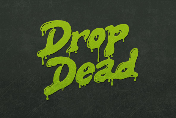
Many Halloween designs require a slimy, bloody, or drippy font and while there are many fonts out there that may look like the perfect solution, I’ve found that many of the drips are too uniform and with words like Halloween that have many double letters, the uniformity becomes too obvious. There are two solutions for this, either outline the font in a vector editing program and change the drips, or find a font that provides many alternates so you can get the random drip effect.
Buy Drop Dead Drip Typeface


