Since we started making WordPress sites almost 6 years ago, we’ve grown almost as much as the platform itself. Our WordPress framework, Canopy, represents the sum total of that growth.
Why Build a Framework?
Work smarter, not harder. Right from the outset, we could see the need for a framework. Many of our projects required similar features, and no programmer worth their salt will miss an opportunity to reuse code. We looked at established frameworks, but found them too feature-bloated to serve our clients’ best interests. Instead, we started with the absolute minimum in WordPress templating and worked our way up from there. This was the rather informal birth of Canopy as the “TCX Template”. It was little more than a collection of useful bits and bobs, aimed at helping get our clients off the ground in WordPress.
We quickly found that having a consistent foundation offered a place to target all of our improvements, as the web and WordPress itself matured. Though many clients presented us with unique challenges, with our framework in place, we could focus on building them intuitive solutions and less on the rudiments. Moreover, all of our clients using Canopy find themselves on a level playing field. When Canopy advances, they all stand to benefit. A project from 2009 may need only a few hours’ work to “upgrade” to a modern 2014 implementation, gaining hundreds of hours of improvements in the process.
So Where is Canopy Now?

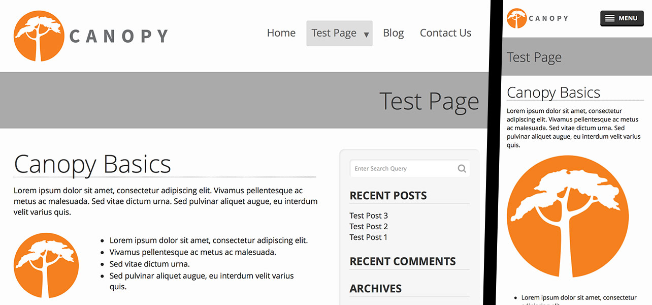
Let’s get the big stuff out of the way. It’s 2014, as of this writing, and the world-wide web is dominated by mobile users. In order to support all web-capable devices, from the desktop down to the phone, and everything in-between, we’ve built Canopy to work responsively. This means that our sites adapt to the physical dimensions of the browser and do their best to behave like first-class citizens in any given environment. This means that graphics will be crisp on high resolution screens, and interaction will follow conventions which users are comfortable with.
In some regards, our most important visitors are search engines. Canopy is written to speak their language, taking advantage of new technologies like OpenGraph and Schema.org to fill in any gaps that may hinder their understanding of a website. On the same token, HTML5 and ARIA landmarks help make our sites more accessible for screen readers.
Clients crave richer and more interactive sites, and that comes with a cost. Serving up all the assets to power visual marvels can be quite taxing on a web server, which is why we’ve cut out the fat, so to speak. Canopy’s assets are streamlined to deliver in parallel so that end users don’t have to wait long before viewing the site. Fonts and CSS are used intelligently to create what used to require virtual boatloads of data to achieve.
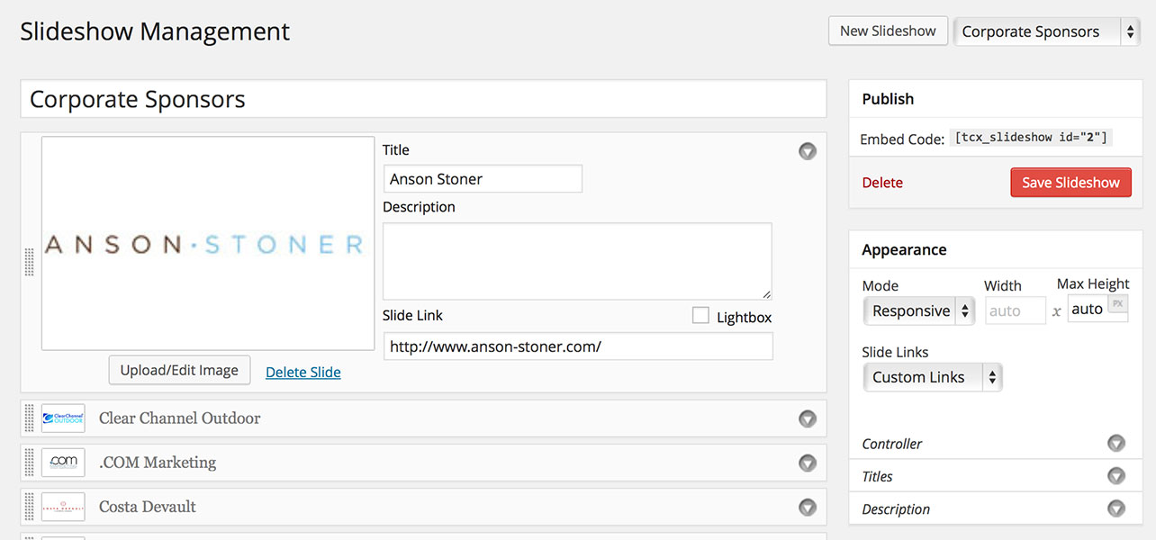
Getting down to details. Even though the WordPress platform has grown to handle many aspects of content management, there are some areas we found it could use our help. Canopy aims to improve the WordPress experience in any way we see being useful to the client, content editor, or the designer. Building an intuitive slideshow management system was one of our first big projects.

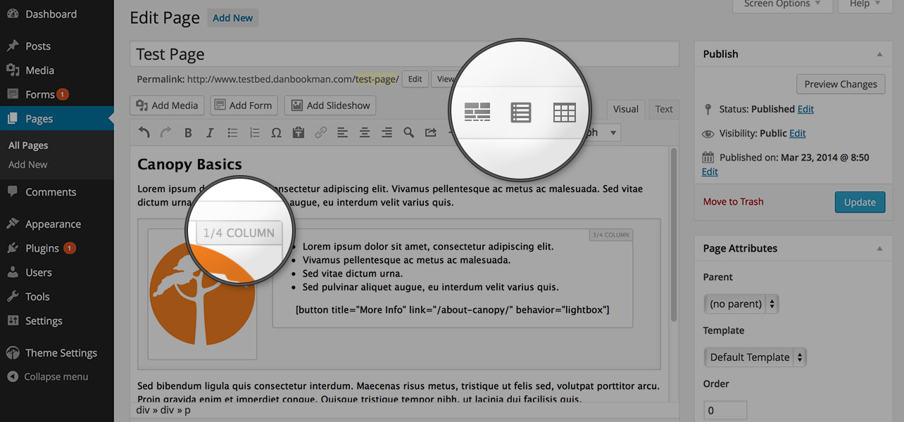
Eventually, our backend improvements came to include solutions to lots of common client needs. Columns, buttons, accordions, lightboxes, and a variety of basic templates fill out the editor’s missing functionality. An overarching configuration panel covers everything else. We’ve seen first hand how theme authors implement these features in a way that clutters at best and mystifies at worst, and that’s one of our biggest pet peeves. Whenever we develop an advanced feature, we pour a lot of effort into distilling it down to its most basic, usable state.

There are a million little details that make Canopy what it is, and like in many things, the whole is greater than the sum of its parts. You’ll have to check out one of our flagship sites to see what I’m talking about.


