What is sexy?
A man observes a woman from across the room and finds himself captivated. Is it her eyes? Her mouth? Her…?
A woman sneaks a glance at a man as he passes her on the street and becomes titillated. Is he sleek? Sophisticated? Or perhaps the right amount of rough around the edges?
Whatever it is that turns us on, we know it when we see it.
That same inherent attraction to our fellow human beings is also what drives our pull to a certain aesthetic. Truth be told, we make a considerable number of insignificant daily choices based on visual enticement. Advertisers know this, and they strategically use design to beguile the masses.
We all know sex sells, but what makes a sexy design? It doesn’t always come down to scantily clad, tanned, and oiled models with sculpted bodies handling the featured product. No, rather a skilled designer arouses the same excitement as the half-naked-practically-going-at-it-gorgeous-supermodel-type ads without resorting to such a cliché tactic.Typography holds great weight within a design. That being the case, when striving for a result that spells S-E-X, the designer must employ the sexiest tools in his/her arsenal. What are these tools? The ten sexiest fonts, of course. Lucky for you, dear reader, we know which ten are the sexiest, and we’re in a sharing mood.
1. Carolyna Pro
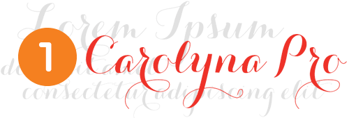
We’re beginning our list with the Audrey Hepburn of the typeface world. Designed by Emily Conners, the talent behind the one-woman foundry Emily Lime, Carolyna Pro is a handwritten calligraphy script with playful, yet classy, to-die-for swashes. The choices of alternate glyphs make this a worldly and well rounded font ready for any occasion.
Carolyna is classic with an everlasting style; the sleek kind of sexy. This is no one-night-stand kind of font, this one you’ll want to spend some time with, get to know, and build a long lasting relationship.
2. Archer
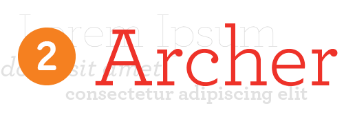
If Archer were a man, he’d be Joseph Gordon Levitt. Typography.com describes Archer as, “Sweet but not saccharine, earnest but not grave … designed to hit just the right notes of forthrightness, credibility, and charm.” Archer may have been designed with Martha Stewart Living in mind, but it’s blending of geometric and antique serif styles with that bold use of ball terminals can – much like a simple smile from Levitt – bring a designer to their knees.
3. FF-Pitu
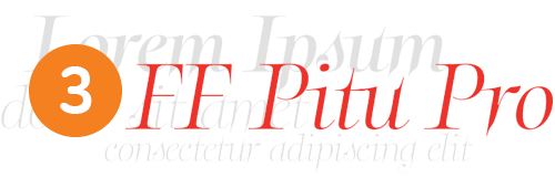
FF-Pitu has a certain je ne sais quoi about its extraordinary cusps, distinctive ligatures, and razor-edged serifs that really whets our appetites. It expresses an enigmatic personality, and those oh-so-sharp serifs remind us somewhat of vampire fangs descending, so we find FF-Pitu to possess the same aura of sexiness as the death dealer leading lady Selene from the Underworld series.She and FF-Pitu are the same in their bold and mysterious versatility. At first glance we’re unsure of what to make of them, but the more we look, the more we like what we see.

4. Bello
For those of you with a palette for a more robust flavor, Bello is for you. The voluptuous Venus of the typeface world, Bello calls to mind Titianesque images of the goddess of love reclined on the couch, hand placed wittingly over that sweet spot. Big, beautiful, with plenty of ligatures, and those start and ending swashes, this font comes with her fair share of cushion for the pushin’.

5. Caslon
Spotting Caslon in a design inflames the soul much in the same manner as that first taste of a finely aged wine. Designed in the eighteenth century to resemble a Dutch Baroque style and yet still stylish today, Caslon is Dorian Gray in font form. An ageless kind of sexy, a hundred years from now it will still turn heads.
*Note: The fonts listed up to this point are all paid fonts. In order to provide a more rounded selection for designers working with little to no budget, the next five are all free fonts.
6. Sofia
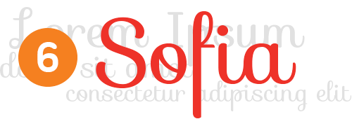
Ah Sofia, how you make our hearts beat faster, make our palms start to sweat. Your curvaceous ligatures and taut swashes call to mind the shapely form of another Sophia – Loren that is. No matter how you spell it, they both possess the same full-figured irresistibility and exotic flair capable of making pulses race everywhere.

7. Sabado
Sabado is young, but bold. Bold, strong, and sturdy, much like a typographic James Dean. This geometric sans-serif font with its strong lines is also likely to raise to icon status for creating dazzlingly eye-catching headlines, though these headlines will be much different from those made by Dean.
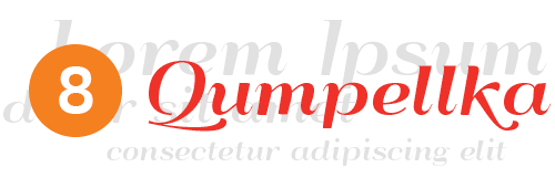
8. Qumpellka No. 12
Another typeface with some curves, this one has a fairly retro feel to it. Tapering at times from thick to thin and ending in those super sassy narrow terminals, Qumpellka No. 12 is reminiscent of that legendary image of Marilyn Monroe’s dress being blown up by the steam grate as she coyly pushes it back down over her unmentionables. Both are undoubtedly sexy while always leaving you wanting just a little bit more.
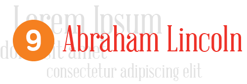
9. Abraham Lincoln
Literally inspired by the tall and skinny proportions of our 16th president, it may seem obvious who this font brings to mind for us. Wrong! Abraham Lincoln, really? Sure he may have been sexy to the ladies of the 19th century, but not so much by todays standards.
No, the sexiness of the Abraham Lincoln font is much more akin to that of the devastatingly handsome Adrien Brody. Noble with its slender hairlines, solid strokes, and those regal bracketed serifs, this is a typeface fit to class up any design in a very striking way.
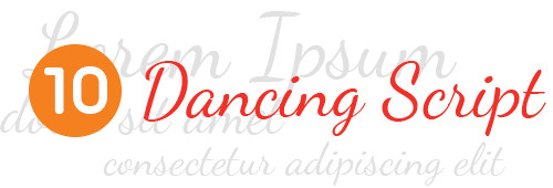
10. Dancing Script
Possibly the best example of a “handwritten” font for our list, Dancing Script demonstrates a casual sort of sexy. In this aspect it appears friendly and approachable similar to the ever smiling Neil Patrick Harris.
It doesn’t need to try too hard; it possesses an easy going and relaxed demeanor that appeals to all. With large caps and letter sizes that change slightly, Dancing Script appears to bounce along the page with spontaneity and grace all at the same time.


